CSS Responsive Flexbox

In this example, CSS Flexbox↗ uses percentages of flex to create different layouts for different screen sizes.

Resize the browser window to see that the direction changes when the screen size is 800px wide or smaller. Did you know the default paragraph font size is 16px which is 12pt? Notice how the width of these headings are defined with a 70-80vw (viewport width), a relative unit.

1. Text and image are left-aligned. In this example, we change the percentage of flex to create different layouts for different screen sizes.

2. Text Left / Image Center. In this example, the image is centered within a sub-container (div) inside a div.
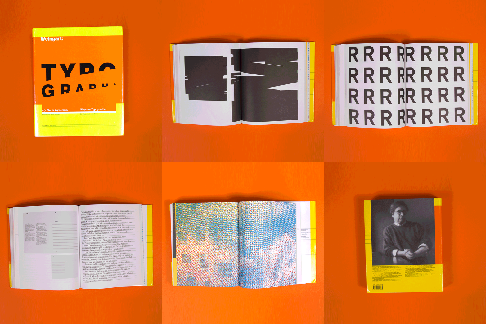
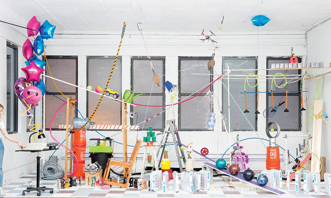
3. Text with Images 3-Up. In this example, we change the percentage of flex to create different layouts for different screen sizes.

4. Image center In this example, the image is centered within a sub-container (div) inside a div.

5. Desktop: 70%. Text with Images 2-Up. In this example, we change the percentage of flex to create different layouts for different screen sizes.

6. Desktop 30%. The negative space can highlight the positive space. Rather than fill the page, let the words breathe!

“Leave space to fill in later.” —Ramon Tejada